YouTube’s redesign makes it easier to watch all the videos you need!
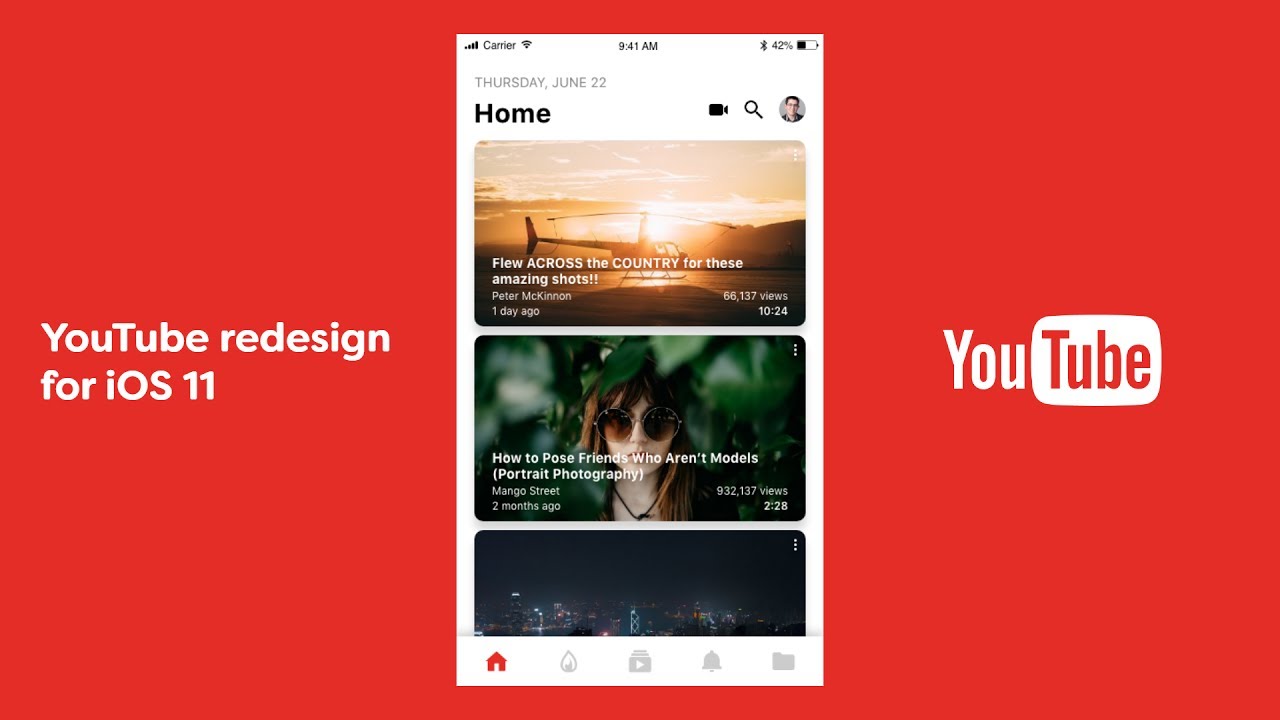
New mobile version setup for YOUTUBE. The new version trades all those red borders for clean white lines, making thumbnails and videos the only things you’ll notice in the app. You can speed up or slow down a video and double-tap on the screen to rewind or fast forward. If you watch a vertical video, YOUTUBE will finally show it properly. No letterboxes, no bars, just a phone-filling vertical video. Even if you don’t watch in full screen, the player shifts to fit whatever size video you’re watching, instead of locking you into that 16:9 space.
The new app brings with it a new icon. Since the early days, YOUTUBE always rocked the black You, followed by the white Tube in a rounded red rectangle. Now, the logo features a red play button—the company’s most iconic signifier—next to the word YouTube.
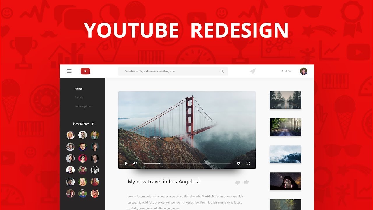
The whole point of the redesign is to take YOUTUBE out of your experience on YOUTUBE. You should be focused only on the video you’re watching, not the UI around it or the recommendation engine behind it. These changes feel like a real step in that direction. It gets the cruft out of the way, makes more kinds of videos feel native, and even helps you find new stuff to watch.
YOUTUBE says the new products are built on a new framework that enables the team to build new stuff even faster. Given that everything about video changes constantly, they’ll need to. People are recording, streaming, watching, commenting, and searching in new ways. YouTube can only be the biggest thing in online video as long as it can keep up.